Emerald Wellness Pharmacy


Brief
Emerald Wellness Pharmacy needed a visual identity that captured their focus on holistic care while connecting to the natural beauty of Emerald, Victoria. The goal was to move beyond a traditional, clinical pharmacy look and feel, creating a modern and inviting brand that reflects growth, wellness, and community care.
Solution
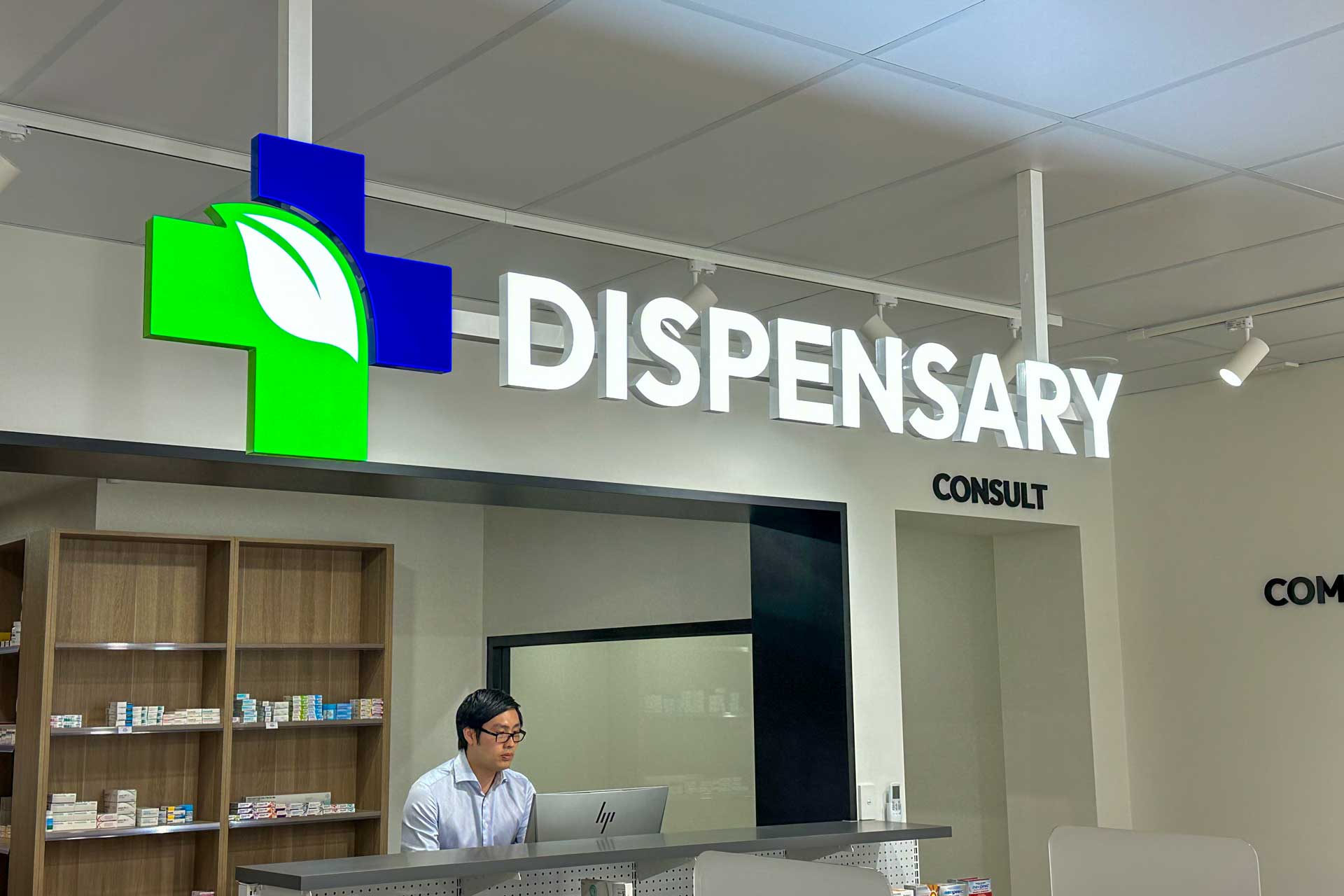
At the core of the identity is the logo, a design that integrates a leaf into the shape of a “+” symbol. The leaf represents growth, care, and vitality, while the “+” symbol ties directly to healthcare, reinforcing the pharmacy’s role as a trusted provider. This seamless combination creates a mark that feels natural, meaningful, and instantly recognisable. The colour palette embraces calming greens and soft greys, reflecting the pharmacy’s connection to nature and its focus on wellness. These natural tones work harmoniously across signage, packaging, and digital applications, creating a brand experience that feels fresh, inviting, and grounded. Typography was chosen for its modern simplicity, ensuring all communications — from signage to online messaging — are clear, approachable, and easy to navigate. Organic, flowing graphic elements inspired by natural patterns add personality and reinforce the connection to holistic health. The result is a cohesive visual identity that positions Emerald Wellness Pharmacy as a hub for wellness and care, deeply rooted in its environment and community.
Services
Visual Identity
, Signage
, Print Collateral


Credits
Visual Identity, Print Collateral and Signage by Studio Atro


