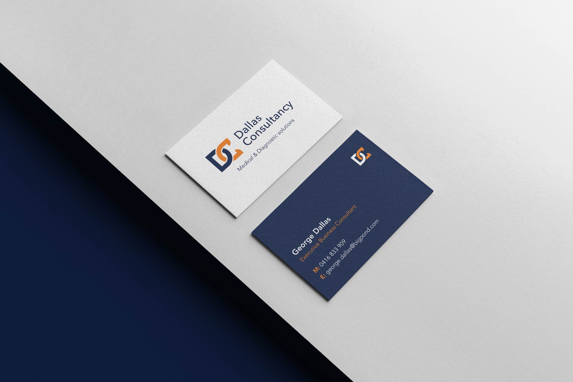
Dallas Consultancy


Brief
Dallas Consultancy bridges the gap between healthcare and business, offering tailored consulting services that drive strategy and outcomes. They needed a visual identity that reflected their expertise, professionalism, and adaptability. With a diverse audience of corporate leaders and healthcare professionals, the brand had to balance trust, precision, and approachability, while maintaining a bold and modern presence.
Solution
The logo is a standout feature of the identity. By intertwining the initials “D” and “C” into a sleek, dynamic mark, we created a symbol that works on multiple levels. The design not only reflects connection and collaboration — core aspects of consultancy work — but also evokes the structure of a DNA strand, a subtle nod to their deep roots in the medical field. The colour palette combines a deep navy blue with a vibrant, energetic orange. The blue conveys trust, professionalism, and stability, while the orange adds a spark of energy, symbolising innovation, momentum, and strategic thinking. This combination creates a sense of balance, ensuring the brand feels both credible and dynamic. Typography was chosen for its clean, contemporary look, enhancing clarity and accessibility across all communications. Subtle graphic details, inspired by networks and interconnected pathways, were introduced to add depth and reinforce the themes of collaboration and connection. The identity was applied across stationery, digital presentations, and branded materials, ensuring a consistent, polished presence. The result is a bold and sophisticated visual system that positions Dallas Consultancy as a trusted, forward-thinking leader in medical consulting, capable of simplifying complexity and driving impactful change.
Services
Visual Identity
, Print Collateral


Credits
Visual Identity and Print Collateral by Studio Atro


