Fabcom Electrics


Brief
Fabcom Electrics needed a visual identity that conveyed professionalism, reliability, and a modern approach to the electrical industry. While their work is grounded in technical precision, the brand identity didn’t need to rely on clichéd representations of the electrical field. Instead, they wanted something clean, bold, and versatile — reflecting their name with simplicity and impact while appealing to residential, commercial, and industrial clients.
Solution
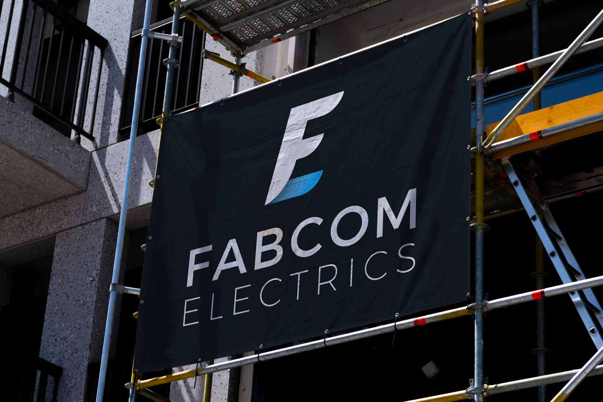
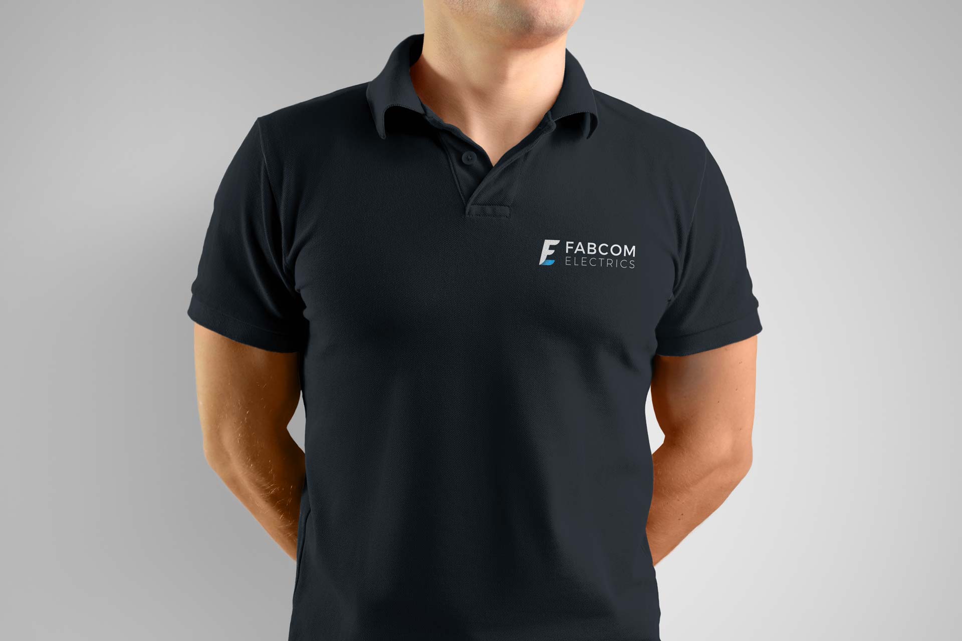
The centrepiece of the brand is the logo — a sleek and modern mark that combines the initials “F” and “E” into a seamless, geometric form. While the mark doesn’t reference tools or circuits, its clean, structured lines create a sense of balance and strength, reflecting the reliability and precision that Fabcom Electrics brings to their work. This simplicity ensures the logo is timeless and versatile across all applications. The colour palette strikes a balance between modernity and professionalism. The use of light blue and dark blue creates a sense of trust, clarity, and expertise, while white, light grey, and grey add neutrality and depth. These tones work together to deliver a fresh, polished aesthetic that feels confident without being overly corporate. The typography is clean and purposeful, featuring a modern sans-serif font that complements the logo’s geometry. This ensures all written communication feels clear, direct, and professional. The new identity comes to life across key touchpoints — vehicles, uniforms, business stationery, and a user-friendly digital presence. The clean visuals ensure every interaction with the brand feels consistent, thoughtful, and highly professional. The result is a bold and timeless identity that positions Fabcom Electrics as a trusted leader in their field: modern, confident, and always delivering with precision.
Services
Visual Identity
, Web Design
, Print Collateral


Credits
Visual Identity, Print Collateral and Web Design & Development by Studio Atro


